Introduction
We have already learned how to plot the information of coverage (Signal Level) of any network - GSM, UMTS or any other technology - based on data from a text file on Google Earth. We have also seen how interfaces can be easily created in Access to interact with applications.
Today we go a bit further, and learn how to plot the data for Best Server of any network, and now we start to use user interfaces, always seeking a better user experience - even if those users be ourselves.
Unlike the coverage indicator (Signal Level), which is discussed by ranges of values, the indicator for Best Server (Best Server) is a quantity of individual values, ie each value has a theme specific. With development, these concepts will become clearer.
Purpose
From the data collected in Test Drive, generate an output file in Google Earth KML format with the information plotted in accordance with our choices - settings, from one interface friendly, and no more running macros directly (though this remains possible, it is worth remembering). We will plot two indicators whose dimensions or quantities include the treatment of virtually all other indicators that we come to consider:
-
Signal Level, as we have seen that is defined by ranges of values. For example, for values that are between - 65 and -75 dBm colorize the point of a certain color.
-
Best Server - a new indicator that we will learn today, that represents the server sector, ie the sector that has the highest level of signal at that point. This indicator is Individual, which means that each value should have a different color.
In other words, plot the data from the drive test on Google Earth, much as we do with thematic maps in MapInfo, now for Thematic Maps Thematic Maps for Ranges and singles.
Our audience is from students to experienced professionals. Therefore we ask for a little understanding and tolerance if some some of the concepts presented today are too basic for you. Moreover, all the tutorials, codes and programs are at a continuous process of editing. This means that if we find any error, for example, grammar or spelling, try to fix it as soon as possible. We would also like to receive your feedback, informing us of errors or passages that were confusing and deserve to be rewritten.
File Structure
need not create any new directory today because we are working with an existing module - Test Drive (1).
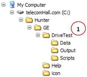
This structure and its files have been created in previous tutorial.
Tutorial on Signal Level at GE
This tutorial is almost a continuation of the previous tutorial where we plot the data as of Coverage (Signal Level) in Google Earth. For this reason, we will not keep repeating all the explanations made there, for example be defined as our input data, as is the case, etc..
Thus, it is essential that you read the entire tutorial again anteriorly, and only then continue from this point forward. If you do not, some explanation here seemed missing.
And read the tutorial GE Hunter Drive Test (Signal Level).
After reading the tutorial so we can continue.
Changes in Object Database
The easiest way to see what is new is that we start with changes in the objects of the database, ie tables, queries, etc.. We will see major changes.
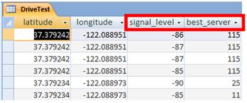
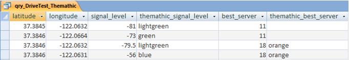
- Table DriveTest: is our table where the data input file are imported. There has been no change since the table already has the two fields that we use today: signal_level and best_server.
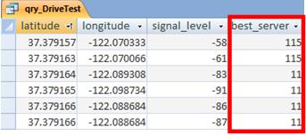
- qry_DriveTest Consultation: a simple change, just add the field best_server the query, since the former had only latitude, longitude and signal_level.
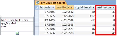
- qry_DriveTest_Coords Query: here also just added the field best_server (only now consulting qry_DriveTest), with one small detail: There are points - coordinates - where we have more than one value, or server. We opted to choose just one, and for this we use a function, in this case the maximum value (Max). This approach is quite satisfactory in practice, you will testify.
- Table tbl_Aux_Value_Color: before speaking in consultation with the major changes we need to talk to an auxiliary table, which we use. It tbl_Aux_Value_Color table, which contains a list of values auxiliary, stating what should be the theme for the corresponding value.
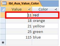
That is, for example the value 11, the table indicates that we color with the color red
Note: This is a sample application where we want you to learn. In fact, the table should have values for all possible values of best_server. In the example, we use these values which are in our data only. But imagine for example in our Test Drive appeared best_server the value 2. What would be your color
Another problem also, which will also see how to resolve future, is the amount of colors. Again in our example, we are using only five colors, as in the example we have only five industries best servers. But when we have dozens of individual values, and colors have to stop being repeated? Yes, in some cases we sectors with the same color - it’s up to us to build algorithms so that colors remain the same as possible separated from each other.
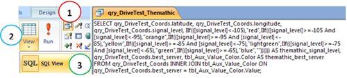
- qry_DriveTest_Themathic Query: is the final query that we use to create the KML file via VBA code. The most important thing is that this table has the latitude and longitude values and signal_leve best_server, and the theme of each. We have seen how to create the thematic signal_level based on ranges. Let us now see how to create the query of how we need, shown below, getting our thematic map of the Best Server.
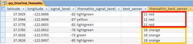
Let’s learn how to show the corresponding values for each record, based on our auxiliary table
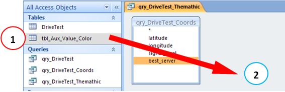
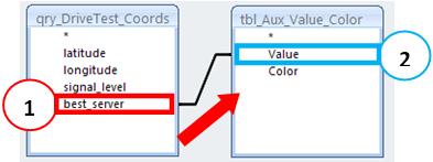
First, open the query qry_DriveTest_Thematic the previous tutorial design mode, click and drag (1) the auxiliary table for the area of consulting (2).
this point, we have a query with two tables (actually one is a query, but we can consider as a table, for short). But the tables “loose” do not have any sense, and we need to define a rule among its data.
It’s a bit like what we’ve heard about relationships, one to one, one for N, etc.. But that now is not so easy to be understood, nor is our goal.
As we speak, we need to somehow join the two tables (or queries), so that they appear as one. And this is simple. Come on.
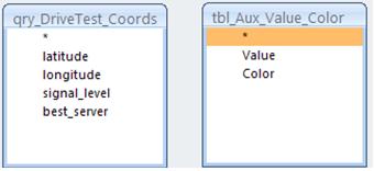
Structure Query, click the field best_server query qry_DriveTest_Coords (1), and drag the field up the Value field in the table tbl_Aux_Value_Color (2). The result is as shown below. It is as if the tables “give the hand” that would make one
What we do may seem simple, but its applications are very interesting, and more comprehensive than the example we are seeing today. Note that we can work with objects like tables and queries, gathering their fields corrspondentes, etc.. Increasingly we will use this characteristic that gives us the SQL. Here you can start realizing the benefits that Access is having in relation to Excel. Not that we do not like Excel, however, until we use it enough. But there are applications where the use of Access is considerably higher.
Further, double-click the line that joins the two tables, we have the properties of the junction.
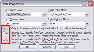
For today we want you to just learn how to join two or more tables or queries, creating a new query. If vcoê well understand this is already itself sufficient. But note that we have three options junction.
1 : the standard way - the data to appear, must be equal (matching) in both tables and / or consultation.
2 : includes all records from the first table / query, and only the records from another table that match. What does this do? Well, all records from the first table / query will appear, and where the values of another table / query, when no corresponding values, the field appears blank! Ok, was confused.
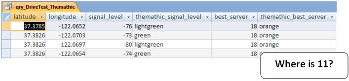
So let’s do a simulation to try to see how they work options 1 and 2 we show. To do so, delete the record from the table to assist with value 11, and Colour Red.
If you run the query again - even with the default join - will see that there seems no rgistro best_server with value equal to 11. That’s because we should have to show up this value in both tables
Now, double click on the line joining the tables, and select option 2.
See Access graphically shows us that there is a junction: the arrow that goes from the table that will have all the data displayed to the table that will display data only when you are corresponding.
Remember that now we do not have the value 11 in our auxiliary table. And then what happens?
As might be expected, when there is corresponding value - 18, the fields associated with this value to match is also shown: Color, in thematic terms. And when we do not have corresponding value - 11, to erase the associated fields appear blank
A pause. This second option will not use today, so do not worry if you do not quite understand. We just want you to finish this tutorial understanding how to join in SQL, or the JOIN statement. In other words, is what we’ve done graphically, joining the two tables by dragging the fields whose values must be equivalent in both. That is, as two or more tables or queries can be joined.
Note: only as observation, remember you can always build queries directly using SQL syntax, you just have to access the Menu Design (1) → Show ( 2) → SQL View (3).
missed talking about the third option: that is nothing more than the other way as option 2. But as I confuse you too much today, let’s explain this better when we use, then give better examples.
Let’s go back to it
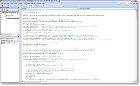
The next objects that are missing to show the changes are our module - mod_GE_DriveTest_Main - where is our code and our VBA macro - which previously was responsible for calling our code. Now this macro will be responsible for opening our main form, and it will be called AutoExec (remember that when a macro is named special Autoexec it runs whenever the database is open).
Not much new to VBA code module mod_GE_DriveTest_Main only included a few instructions to process the new indicator. The novelty is that now we have code within forms. So let’s talk a little about them before.
Forms - our Interface
The interface of our programs are defined by forms, either in Access, Excel, Mapinfo or any other software to allow programming. To begin, let’s take a look as our final form of this module.
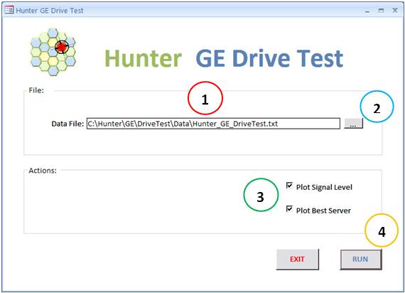
Taking a number of details such as images (right), labels, titles, buttons, close / minimize / maximize, etc, we highlight four main functions, which we detail below. < / p>
-
text box with a file name being processed, with an initial suggestion of a default file already pre-loaded;
-
button to select a new file instead of the suggested;
-
Options for whom or which indicators should be dealt with: one, both or neither;
-
Buttons to Rotate and Exit.
See this interface is not as complete as possible, a number of possibilities that create a better user experience, or may be even more friendly. For example, we could also have an option to indicate where we want to save the output file - including defining the name. Or an option to open Windows Explorer directly to the folder where the files are. Option to specify whether to overwrite the output file if it already exists. And so on.
But what we have here is enough to demonstrate what we need so far. Increasingly seek to improve the user experience, even if that user be ourselves.
Simple Tips for improving the user experience can be even ScreenTips. For example, when mousing over, indicate what will be done.
in VBA Forms
When we work as forms, is important to know how to insert the code into a control like a button for example.
We have seen this in the previous tutorial, but to insert the code for an event such as a mouse click - On Click event - we can do the following below.
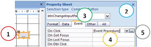
First select the control (1), and access their Properties (2). Events tab, select the desired event (3) the arrow and select value [Event Procedure] or double-click the blank line (4). Then click the button with three dots (5). This takes you straight to the VBA programming environment.
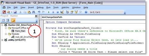
Note that now we’re putting our functions and procedures in a module. The VBA is stored within the form itself (1).
References, remember them?
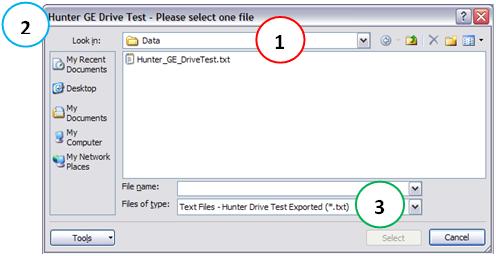
In many applications, including this simple, we use a dialog box to select a file. This type of dialog box is familiar to Windows users, and allows us to navigate to a file and select it.
There are several ways of doing this - and almost everything we do, it is true. But then you have a particularity: we use the object’s Office File Dialog. To use an Office object, as in this case, we use a reference. That is, we need to tell Access to use a range of functions and other properties that are encapsulated in a DLL. Okay, again complicated language. Although not as complicated as it sounds, the names scare you, and for now, accept only the following: when you include references in the VBA project in Access, you can use a series of extensions that allow this reference. We can make a crude analogy as an Excel add-in, once loaded, allows us to use such new formulations.
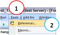
Even that is not understood in the VBE go to Tools Menu (1) → References (2).
On the screen that appears, choose the Library Microsoft Office 12.0 Object Library. Note: It may be that your Office library has a different number. 12 simply means Office 2007, Office 11 means 2003. No matter what the number, select the library Microsfot Office XX.X Object Library.
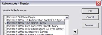
Important Note: The application of this example was done with the 2007 version (Office 12) Access. If you use a different version, you find a mistake, and need to change the reference to the corresponding
There, you can already use the Office Object Library. Note: This library has many more features than a simple dialog box. In his time, we will see several.
Once available the library, call the dialog for example as shown below.
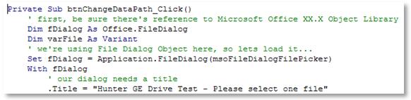
Note that simply manipulating via custom code dialog box, for example by setting the directory where it should be initially open (1), its title (2) and even types customized files (3). That gives above all a professional look to our applications.
code
As seen above, the VBA code is part of the module, and part of the form. Both can be accessed by the VBE. The codes are commented, but if in doubt, contact.
Our application
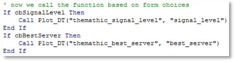
Although simple, the application that we saw today has served to demonstrate the use of interfaces on modules Tool Hunter. The end result can be seen, depending on the value of the checkbox.
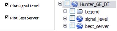
And this is part of the VBA code that makes the choices. Depending on whether the checkbox is selected, the indicator is plotted.
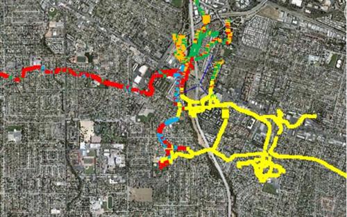
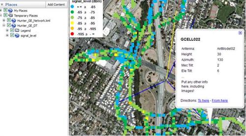
And the results seen below person could, for example with a plot as an example for Best Server. Note that the Best Server does not need subtitles. But it also would not be so difficult to do one. When we have more indicators, each will have its own legend.
And as we’ve done before, we have the data coverage (Signal Level) plotted.
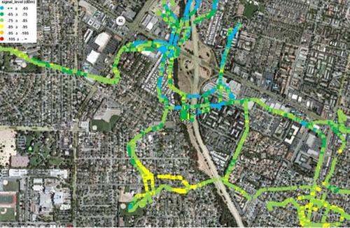
Note: remember that the data are not perfectly aligned with the streets of Google Earth because they were generated randomly and not by an error in our program. When you use with real data from your network, you will see that the data are perfectly aligned, except for some inaccuracies of GPS.
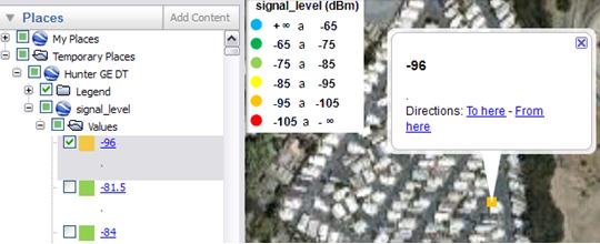
You’ve seen that all points are clickable, both in the main interface, the browser on the side. For example, if you want to navigate to a specific level of bad sign, just double click on it.
Furthermore, you use all the resources that are available. For example, you can open our network Hunter_GE_Network, and analyzing drive test along with the information sector. You can quickly verify that the antenna is being used, what the tilde, etc..
Increasingly we increase our resources, and as a result of our analysis is becoming more simplified. The more information we have in a simple and affordable, the faster we can determine what actions should be taken.
A set of centralized information and quality: this is essential in our day to day, because effectively increase our productivity, our results accordingly. That is the philosophy Tool Hunter.
Conclusion
We learned today how to plot the information of Coverage and Best Server in any network - be it GSM, UMTS or other technology. And for this we use only the basic data - values - available in a file in text format that can be exported from any software collection and / or processing - where the same that was used to perform the Test Drive.
We also saw how to create interfaces in Access is easy, and how their use improves the user experience.
learned a few more new concepts, such as using objects after setting up of references, like the case of a data box File Open dialog of Windows.
The end result is still simple, but as expected, demonstrating the possibilities for the future, but already being applied in practice, in our constant quest for speed in processing, accuracy and ease in the analysis operation.
We hope you’ve enjoyed. If you have any doubts, find the answers posting your comments in the blog or via our support via chat or email.
Till our next meeting, and remember: Your success is our success!
Download
Download Source Code: Blog_017_Hunter_GE_DriveTest_(best_server).zip (239.2 KB)