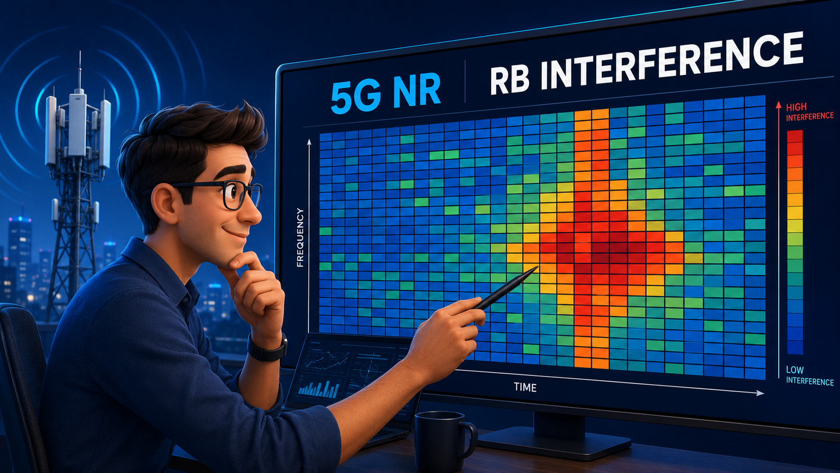
I think a PRB heatmap would probably be the clearest way to visualize it - PRB 0–272 on the X-axis, time on the Y-axis, and the interference level represented by color.
That would make it pretty easy to spot interference peaks and see which PRBs are being affected over time.
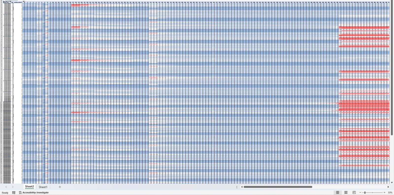
But I’m not able to see all the PRBs in one view. I have to scroll left and right, which makes it difficult to get the overall interference pattern at a glance.
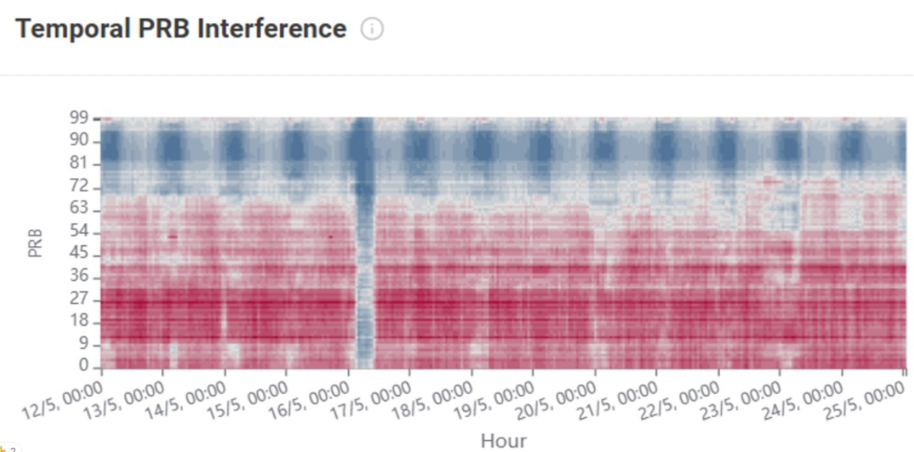
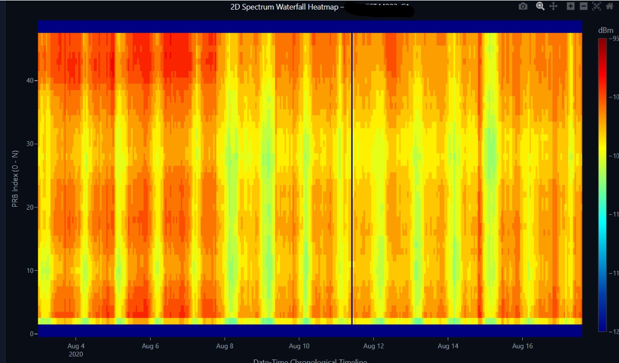
Maybe you could use a heatmap like this, with the PRBs on the Y-axis and time on the X-axis. That way, all 273 PRBs can be displayed in a single view, so you don’t have to keep scrolling horizontally.
You could ask Claude, ChatGPT, or any other AI to generate the script for whatever tool you prefer (Python, VBA, etc.). Just attach your raw data format along with this image as a reference for the target visualization.
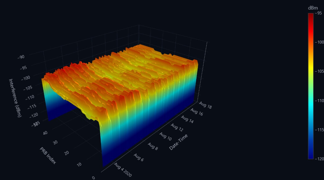
This is from an old project I worked on. Nowadays, you can build a pretty comprehensive interference dashboard with Claude or Gemini just by giving it a good prompt and your raw data.
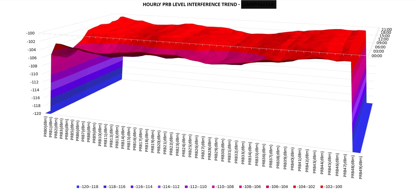
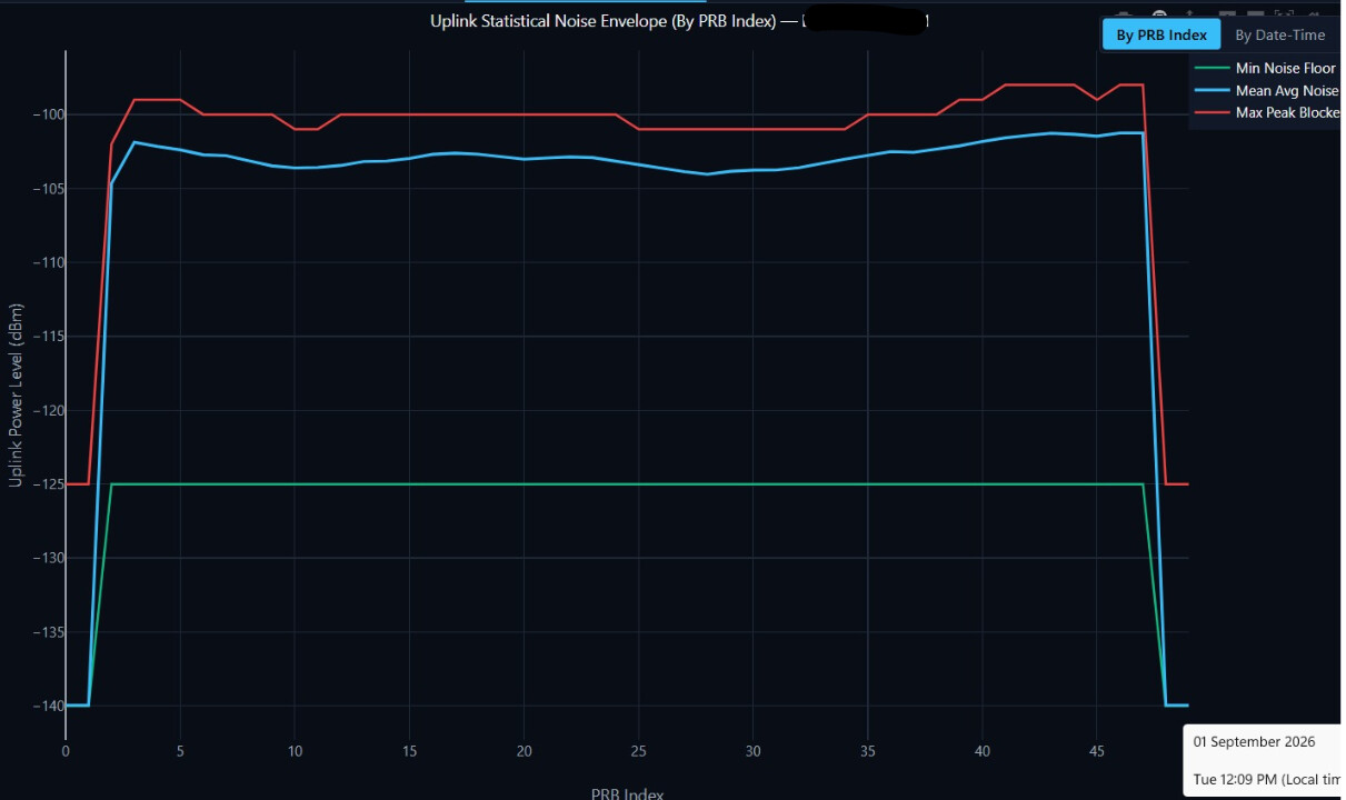
You could include things like a waterfall plot, mean/min/max plots, and cascade plots to get a much better view of the interference behavior over time and across the PRBs.
You can select the site, cells, legend range, colors, and even reorient the plots — all with just a prompt!!!
Data analytics has become that easy. No need to spend hours writing Python/Java scripts or Excel macros. Just use a local LLM or one of the online ones, feed it your data, and ask it to build what you need.
Agree the plotting is the easy part now, an LLM or a short script draws the heatmap fine. What decides whether the picture is useful is the input and how you read it, and that is where most of these go wrong.
For a real per-RB view you need the per-PRB uplink received interference power, one value per PRB across the band, per cell, per ROP, not cell-level UL RSSI or a single interference KPI, which hide exactly what you are trying to see. The exact counter is vendor and release specific, on Ericsson it is the per-PRB PUSCH received interference power measurement, on Huawei the per-RB UL interference counter, so pull that from your MOM rather than an averaged cell metric.
Then the plot is a heatmap, PRB index on one axis, time or ROP on the other, colour as interference power in dBm, one per cell. The read is the value, not the colours: a narrow band of hot PRBs that stays fixed is an external interferer, a repeater, or PIM on specific frequencies, while a flat raised floor across all PRBs is broadband noise or receiver desense. Same heatmap, two different root causes. Feed the LLM per-PRB interference power, not cell-average RSSI, and fix the colour scale so a 3 dB local rise does not read the same as a 20 dB interferer.
Hi everyone, I released a free vendor-neutral PRB interference visualizer. It accepts CSV and XLSX, supports wide and long counter formats, and generates a heatmap plus PRB and time statistics. Files stay in the browser.