Histograms can reveal the truth.
Or completely distort it.
It all depends on one small choice:
How you bin your data.
Histograms turn data into something you can see.
![]() They highlight trends.
They highlight trends.
![]() They expose patterns.
They expose patterns.
![]() They bring insights to life.
They bring insights to life.
But one misstep—poor binning—ruins it all.
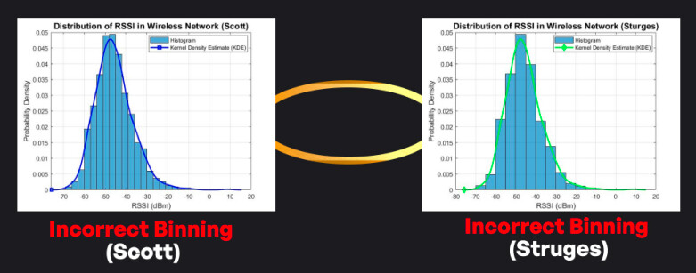
Let’s take signal strength as an example.
Bin it wrong, and…
Strong signals look weak.
Weak signals seem reliable.
The data lies, and you believe it.
This leads to:
![]() Wasted resources.
Wasted resources.
![]() Overconfident planning.
Overconfident planning.
![]() Missed interference signals.
Missed interference signals.
That’s why bin size isn’t a detail—it’s a decision.
To get it right:
![]() Pick a binning method that fits your data.
Pick a binning method that fits your data.
![]() Visualize the result—does it make sense?
Visualize the result—does it make sense?
![]() Tweak the bins until clarity emerges.
Tweak the bins until clarity emerges.
![]() Refine over time as the data shifts.
Refine over time as the data shifts.
Binning feels unimportant.
But that doesn’t mean it should be ignored.
Thanks for reading.
PDF: ![]()
Histograms and Binning (By Furqan Jameel).pdf (3.9 MB)
LinkedIn: ![]()