Hi Experts.
What are your thoughts on this graph?
Do you agree with the 20/80 rule it represents?
Could you please explain what represent this graph?
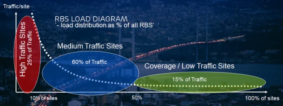
This illustrates the distribution of traffic load across different types of RBS
Like:
High Traffic Sites = 10% of sites, 25% of traffic.
But seems this is an “old” illustration.
In digital era situation is vice versa for some operators…
What is action plan / insights to be implemented?