Drive-test samples become useful only when they are converted into a clear coverage picture.
That is where an RSRP heatmap helps.
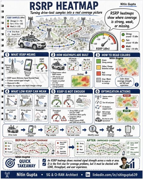
RSRP means Reference Signal Received Power.
It shows the received signal strength from the serving cell and helps identify where network coverage is strong, weak, or missing.
In drive testing, every sample is collected with GPS location.
Then samples are plotted on a map.
Color bands help engineers quickly understand coverage behavior:
Green:
Strong coverage
Yellow / Orange:
Borderline coverage
Red:
Weak coverage
Gray / Blank:
No sample or no coverage
But one important point:
RSRP alone is not enough.
A location can have strong RSRP but still poor user experience because of:
- Poor SINR
- Interference
- Congestion
- Wrong antenna direction
- Overshooting cell
- Missing nearby site
- Blocked or shadowed area
- Poor handover condition
That is why RSRP must always be checked with SINR, throughput, handover events, drops, RLF, and user experience KPIs.
Typical optimization actions after RSRP heatmap analysis:
- Improve antenna direction
- Tune tilt and power
- Fix blocked or swapped sectors
- Add coverage solution where needed
- Re-drive to verify improvement
Before optimization:
Patchy coverage, weak zones, coverage gaps, and unreliable experience.
After optimization:
Better RSRP levels, fewer weak zones, and more consistent coverage.
Simple takeaway:
An RSRP heatmap is the first clue for coverage problems.
It shows where the signal is weak, but the real diagnosis comes when RSRP is checked together with SINR, throughput, mobility, and user experience.
LinkedIn: ![]()