Introduction
Mapinfo has a very nice tool to map relationships between tables based on a designated field: the Spider Graph Tool.

It has a lot of uses. For example in Telecommunications it is widely used to link Drive Test data with data for each sector (for example for PSC or PCI), highlighting the attributes and providing a visual and analytic insight in your data.
But the best way to undesrtand this is by example, so let’s do it.
Download the files available at the end of this tutorial, and follow this quick tutorial to learn this great tip.
Spider Chart
So, let’s see how to use Mapinfo to generate a Spider Graphic.

Maybe you got scared the first time you hear about this chart. But like everything in life, when we realized how something till now unknown can be useful to us. ![]()
And to create the Spider Graph Mapinfo, there is a MBX - Mapbasic program - that comes installed with it, we just need to enable it - as we shall soon see.
If you want to read a brief explanation about this tool, you can access the Mapinfo website:
http://testdrive.mapinfo.com/techsupp/miprod.nsf/kbase_by_product/C831A18D358C12E3852571450068B995
But basically, the tool draws lines between objects - which can be a table or a union of two tables - that is the case as an example that will demonstrate today.
When these lines are drawn, a new table is created according to the corresponding values in same columns, that can be color coded and with a new column that shows the length of each line.
Enough of theory, and let’s get to work!
After downloading the files in this article, open it on your computer. To open the Mapinfo Workspace, after uncompressing the files in some local folder, double click the file spider_graph.wor.
On the main screen, you will find a standard Mapinfo Workspace, with three tables:
-
Sites: reference only, with some random sites.
-
Sectors: A table with information of sectors (or cells), with a NAME field with the CellID information of each cell.
-
sample_data, which contains data from a dummy drive test. Today the most important thing here is not the drive test data info, as the Signal Level. Only one field is important, indeed essential - the NAME field, containing the CellID. It is this field that will allow the union of this table with a table of cells (Sectors table).
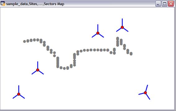
Regardless of what Indicator is being analyzed with the Spider Graph, it allows us to draw the lines between the cells (Sector table) and Data.
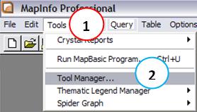
To enable this tool, go to the Menu Tools (1) → Tool Manager… (2).
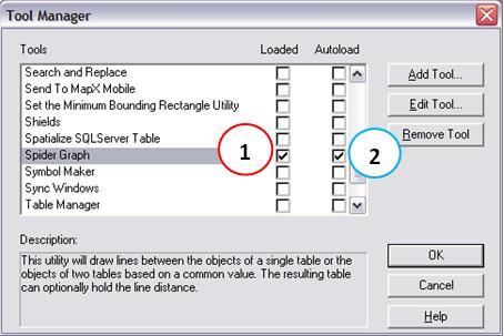
At Tool Manager, select the option to load (enable) this tool - Spider Graph (1). If you want this tool to be loaded automatically whenever the Mapinfo is open, also check the Autoload option (2).
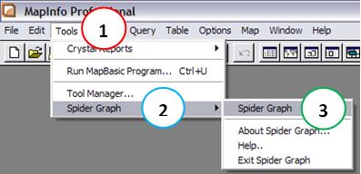
Now you can open the interface of the tool that creates a Spider Graph, by accessing Menu: Tools (1) → Spider Graph (2) → Spider Graph (3).
In the new window, we must make some choices, but they are very intuitive.
First, choose the source and destination table (1) and (2). In this case, our Origin Table is the Sectors with all cells data.
Also, for each of these tables we should indicate the chosen field that is common to both, and that will be used for match (3) and (4). In our case, in both tables the fields were called NAME, and contains the CellID for the cells.
And we can select (5) which fields we want to include in the new created table. (To select more than one field, use the Control key).
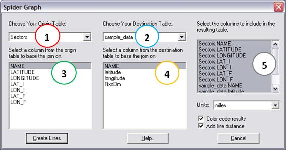
Note that you still have the option to set the unit of measure (Units:), and also highlight the options Color code results, coloring each line grouped by a common field of color, and Add line distance option to include the length line.
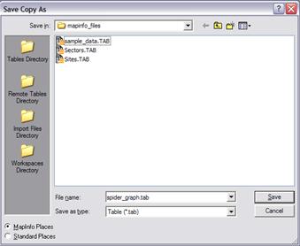
You can create lines with the Create Lines button from the main interface of the program Spider Graph, where you will be prompted for a name for the new table, which can be any name you want. Here saved as spider_graph.tab only to facilitate demonstration.
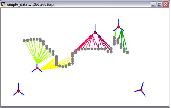
Okay, now it becomes much easier to understand how such a graph can help us, don’t you agree?
The spider graph allows us to check at each point what is dominant cells, if a sector is serving a wrong area - signal spurious, if there is cable swaps, etc … Also find same PCI used in different cells.
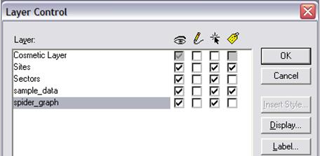
And we can show it a little better, right-clicking on the map, choosing Control Layer, and enabling some labels (1).
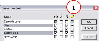
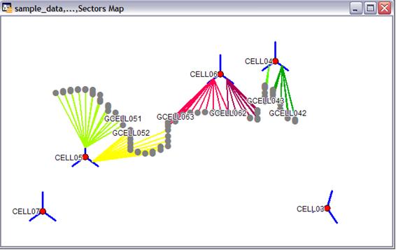
Finally, note that the Spider Graph was saved as a new table, and was automatically added to the workspace. So we can do all operations such as creating a thematic map on it, i.e. changing colors, shapes, etc., among other attributes of the lines of Spider Graph based for example on the values of the indicator analysis or the distance (length) of each line .
And we can also create thematic maps for indicators in our analysis, of course. But this is a topic for another day. ![]()
Let’s stop here today, and give you time to practice Spider Graph for rapid analysis in its drive tests.
.
Conclusion
This was a brief introduction to MapInfo, with an example that can be very useful for a quick check new sites using drive tests - by using Spider Graph.
Even if you already knew this trick, continue participating. The idea here, as in all articles, is always to be quick and straightforward, with only what is worth - and must - be seen, always seeking out new tips that might bring better results.
Download
Download: telecomHall_Mapinfo_SpiderGraph.zip (19.6 KB)