Introduction
There’s no doubt the main objective of Telecommunications Engineers is to get the best possible performance of the system, in terms of Call Quality, Dropped and Block Rates, QoS and Data Speed, Availability of the Network or any other indicator.
With the Excellence of Performance, it’s easier to increase the customer base and also increase its satisfaction. You can also do a better resources management - OPEX and CAPEX, that can be translated into significant gains also in Money Savings. In other words, we only have benefits.
But how to ensure the Excellence of Network Performance?
We have seen that with the enormous amount of elements (in fact, an enormous amount of any magnitude - elements, customers, counters, alarms …) is essential to use an efficient methodology that allows us to manage it all.
And that’s exactly what we begin to see today. Of course, there is no single silver bullet to analyze a network, but rather we’re learning what can be done smoothly.
So, what can we do?
Let’s proceed to the methodology, with suggestions of ‘ways of working’ that apply to any scenario.
The suggested procedure is very simple.
First, we do a daily access to OSS (for each technology), and download one or more templates with raw counters. These exported files can be of various types, and can be stored in a local directory. Later, they’re processed and imported into a database - our data that will be accumulated in the performance tables.
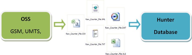
Note: As we said, the files exported from the OSS can be of any type (XLS, XML, CSV, TXT, etc. …). The important thing is that it contains basic/necessary counters, so the macro can parse and import to your specific format.
Okay, that’s it!
Didn’t understand? Okay, we’ll explain.
This should be the ‘only’ task that Telecom Engineer must do to be able to analyze the network. (Although even that wouldn’t be needed, as the export of data from the OSS’s can be automated!).
But let’s consider the situation where you get to the office every day, and has access the OSS’s. Log in, download the data, runs the processing macro, and… done!
Several reports are instantly available, as we will see in this and next tutorials.
But the data on my network are different, what do I do?
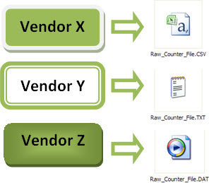
Well, that’s starting to get complex. Remember, we can not cover everything here, for every vendor specific format, etc… We can not standardize ‘everything’. Depending on your vendor, your original data will be different.
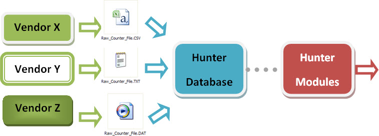
But one thing we can: the basic data, after being treated, are imported into standardized tables, with the main indicators as shown in previous tutorials.
From these tables, all other modules in the Hunter will be ready - fully integrated!
This is the organization and standardization adopted, especially in the nomenclature of databases, tables and fields.
My Network Performance Data (Performance Tables) are currently available, but in another format. And then, how do I proceed?
In cases where the input data are not obtained and / or processed by you, or you do not have total control over the format, we can make a ‘correlation’ with our expected format.
Relax, this is simple. Let us explain.
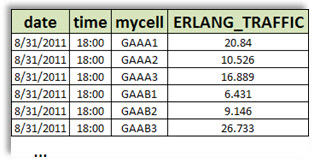
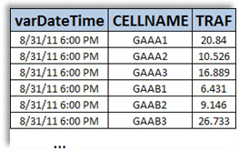
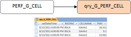
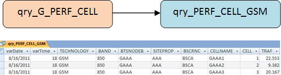
First, assume that your data is the format as shown below (Traffic Data per Cell).
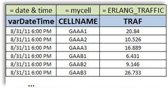
But the format it should be is the following:
This correlation is quite simple to do. Just create a query with calculated fields ‘exactly’ as it should be.
You already know that Access uses (calls) ‘Tables’ and ‘Queries’ in much the same way, with regard to obtaining its data. That is, you can ‘Select All from a table’ or ‘Select All from a Query’.
Well, that’s it for now. With this understanding, you should be able to smoothly adjust the modules into your scenario.
Hunter Report: Live Performance
If we presented here ALL the complete solution of the Performance Modules, with all existing reports, for sure you would have difficulties. This is because for eavery modules we always insert new concepts and algorithms. Although simpler, it needs to be well understood.
So let’s begin today with a first module: ‘Live Performance’. This module is responsible for processing our base table data, and send the result by e-mail and also writing it to some files.
This module in turn has a series of sub-modules, we will see in due course.
We begin today with the first and most basic of them, ‘Live Performance: Summary’.
Hunter Report: Live Performance - Summary
After the necessary introductions, let’s talk about today’s module.
From now on, and increasingly, we’ll be very superficial when demonstrating actions like how to create simple queries, calculated fields, functions, etc … The reason is that you should already know how to do it. Otherwise, review some previous tutorials.
User Interface
The best way to talk about this module is presenting what it does. The following are its main interface.
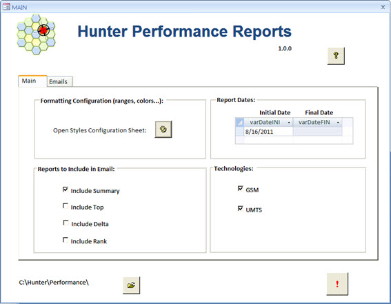
The options are pretty intuitive.
At ‘Main’ guide we have options to open the spreadsheet with our data configuration (as they should be formatted), choose the date for the report, choose which sub-reports should be presented, and what technologies should be included.
In another guide - ‘emails’, we can choose which recipients will receive the reports.
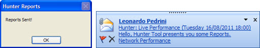
All this however will be easier to understand when you practice. That is, after receiving the files, simply click the ‘RUN’, and you will receive e-mail with the report according to your settings!
In other words, you initially have your data in a very ‘basic’ way, as in the original table.
After clicking the ‘RUN’, in seconds you already have a report available - including at your e-mail - about your network.

Note: All data presented are ficticious, like all the sample data we use for Hunter System. However, it serves as a reference for creating / adapting the system to the different scenarios of each network.
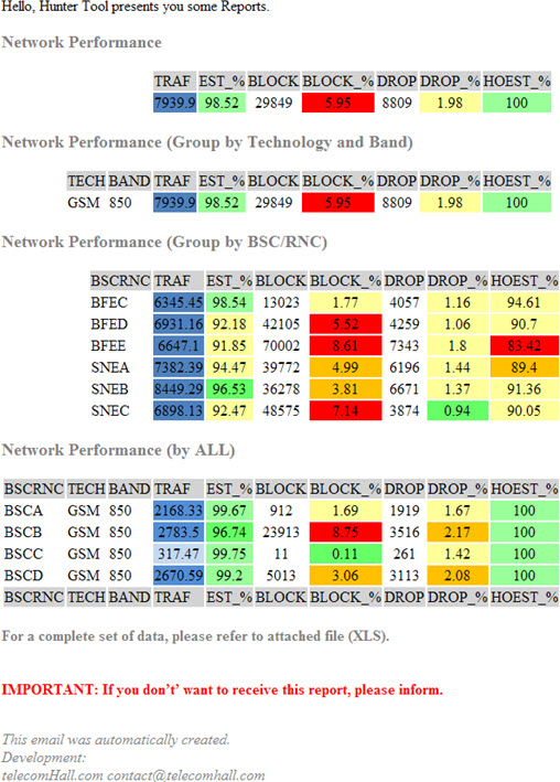
Note: we are just beginning to deal with the Hunter Performance algorithms, and today’s report is still simple, but it is nonetheless interesting. It presents a summary of the network for the selected period, ie, in general, as the network is in terms of the key indicators to be monitored!
Anyway it is very important that you familiarize yourself with all procedures, otherwise, you can not evolve.
The best way to explore each report (like that of today) is through visualization of the email.
We will not detail each specific part, but overall, this report provides summaries (‘Summary’) Performance Network.
It is divided into four subparts:
- General overview of the Network.
- Network Summary grouped by technology and Band.
- Network Summary grouped by BSC/RNC.
- Network Summary grouped by BSC/RNC, Technology and Band.
Note: It is important to remember here that these reports are suggested, and ready for that version of that module. However, as always, you can and should make your customizations, either by changing existing reports, or adding / inserting new reports.
Config File - Names, Ranges, Colors
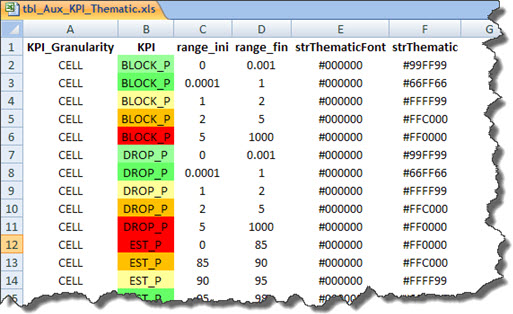
Our solution uses an Excel spreadsheet as an aid to do the settings of Indicators, Ranges and Colors.
By clicking the corresponding button on the main interface, you open this file, and you can make changes. (Remember to close the file when running the reports, otherwise program will run slow).
This file (Excel) is linked in our script, and thus is available as a table.
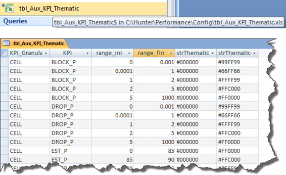
The fields of this file are in turn accessed via a query with filter criteria based on each used Indicator. (This gets a bit confusing to understand now. Don’t worry, it’ll be easier soon, when we explain the general procedures).
This file has some configuration fields, and its simplified explanation is shown below.
- KPI_Granularity: You can define settings for different granularities. For example, the ranges are different for Traffic for ‘cell’ and Traffic for ‘BSC’ - in the latter, the values should be higher.
- KPI: the name of the indicator, as our standardization. We’ll discuss more in future.
- ‘range_ini’ and ‘range_fin’: initial value and final value that defines the range of a particular style (color, etc…).
- strThematicFont: represents the color of the text associated to the theme.
- strThematic: represents the color that will fill the HTML table cell where you tell us how much - according to the criteria ‘range_ini’ and ‘range_fin’.
The Excel spreadsheet with the data configuration has a small VBA code that updates the values of the thematic areas, according to the colors and fonts of the cells in column ‘KPI’. It is a very simple code that reads the properties ‘Interior.Color’ and ‘Font.Color’ of the corresponding Excel cells.
More details you will get when using, but again: do not worry. It’s all very intuitive and simple.
The Application
With the main considerations, let’s talk about the application itself. Remember that we are increasingly addressing only the procedural aspects. Details of creating, editing or changing objects such as queries, tables and codes can be accessed directly from the sample files.
Too many objects?
Once you open the sample database, you’ll realize that it takes a considerable amount of objects - queries, tables, etc …
Again, there is no reason to worry. Yes, there are several tables and queries - but all done in an organized way, and very similar for all indicators.
In other words, if we create only one report (eg for Traffic (‘TRAF’) as we will demonstrate below, the number of elements would be extremely minor).
But let’s follow the procedure from beginning to end, and there you will see that everything is very simple, we just need to know what to do. And remember, you are in our company.
Increasing the Reports Speed!
The first thing to do is increase the speed of processing of our data.

And one way to achieve this is to create temporary tables, with only the data that we present in the reports. Thus, all other queries are executed almost instantly!
In our case today, we are dealing with ‘Summary’ report, a summary of the overall network for a certain period. But our source table with Performance Data from has a lot more records - for a lot of periods - usually with data from more than one month.
Note: Of course you can create queries directly from the original table - the end result is the same. But this practice to store the relevant data into a temporary table is highly recommended, and it can be proved particularly by the speed reached.
Anyway, let’s continue.
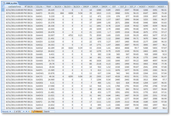
Input Table (with Performance Data)
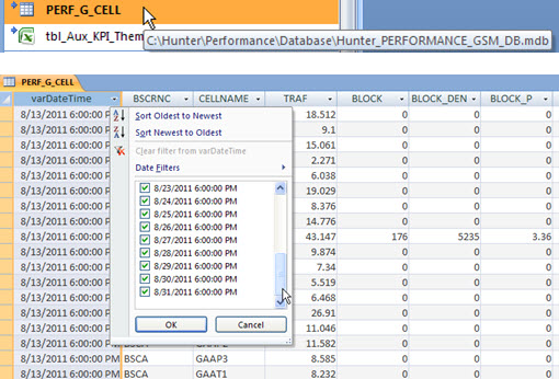
In our example today, let’s consider a table with the GSM Performance data crammed into a table for three weeks.
This is our standard ‘PERF_G_CELL’. As we have already processed this table with another module, we simply create a link to it.
Note: If by chance you do not already have this table in this format, and have the data in another way, just make the appropriate connections. For example, if you have your data in an Excel spreadsheet Performance, link this table to the database. In a recent tutorial on other Access tips, we show you how simple it is to integrate any existing base (TXT, CSV, XLS, MDB, …) with other Access databases, and so allows the operation of all existing Hunter Modules.
Anyway, since you have this data available for download, we will follow up with them. Note that we have performance data from 13 to 31, October 2011.
Sure, our initial data are there, ready to be worked out, so what?
Let’s get started.
Accumulate the relevant data in Temporary Tables
First, we will accumulate the data for a particular period in our temporary table.
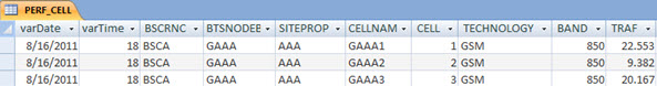
This table is ‘PERF_CELL’. It is the base of everything, all the reports that we do today!!!
‘Buckle up’ because we talk about all objects, and their main functions in the application.
We use a query to help make a link with the data from our original table. The goal is to make some adjustments such as changing a name of a field to the desired format (‘MyTraffic’ -> ‘TRAF’). As in our example the data is already adequate, we will proceed.
So we have a new query, based on this query that do the link, again allowing some more tweaking, now for example by matching the physical basis and configuration. For example, from CELLNAME, we can set the Technology and what is the Band of our Cell, if this info is not present in our Performance table.
In our case, we do not have this information, but only for simplicity, we just assign Technology as’ GSM 'and band as ‘850’ - the right way would be getting this info from another table - like ‘tbl_Network’.
In short, we then have the data we need in the appropriate format (field names).
IMPORTANT: If your data are not shown in the format, be aware that this is the ‘base query’, which must be obtained from your data. To do this, change the query accordingly. If in doubt, as we said, in the Tips Section have a tutorial demonstrating how to integrate data from different formats to a standard format (like this case). In other words, making this match classifications, from now on you do not need to do anything, because everything is standardized!
Then continuing, we first accumulate the network performance data for cells in a standard table named ‘PERF_CELL’.
This is our temporary table, where the data that we’ll use in reports are accumulated (stored).
With the VBA code, we can select data for a particular Period, and for a given Technology. This is done as follows: First, we delete the data from this temporary table. Then run a query with filters for ‘Period’ and ‘Technology’.
The Period filter is the value stored in the auxiliary table ‘tbl_Aux_DATE’, and Technology filter is applied directly in the VBA code, according to the arguments of the invoked Function.
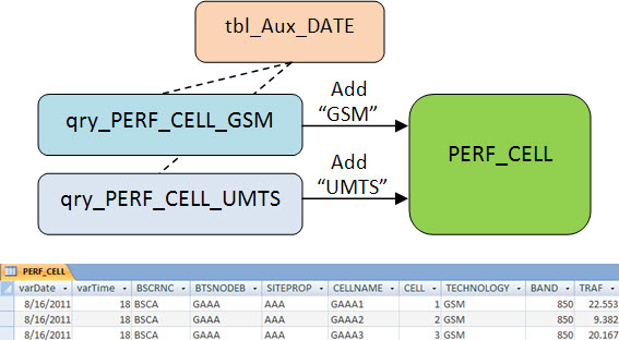
Note: you will notice that our sample data today are just ‘GSM’, but the procedure to add data ‘UMTS’ or any other technology would be exactly the same.
From our data in table ‘PERF_CELL’, we create other temporary tables, now with the data grouped into some granularities: ‘NET’, ‘NET_TECHBAND’, ‘NET_BSCRNC’ and ‘NET_BSCRNC_TECHBAND’.
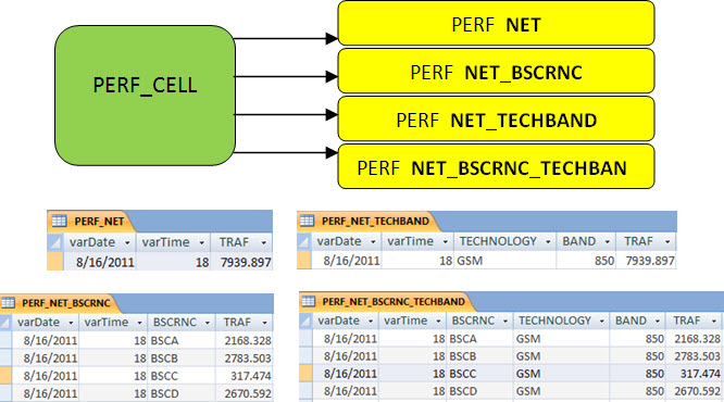
These temporary tables represent summaries of system performance with different points of view, for example grouped by BSC/RNC, or Technology.
Now, the daata these tables can easily be accessed by code, and the results can be exported to the appropriate output formats.
Creating Themes and HTML
But we go beyond just showing the data in tables. We want to show the formatted data, or themed according to our settings. For example, if the Dropped Calls Rate is too high, must be displayed in red. If it’s very low, in green. All according to the previously defined ranges and colors.
So let’s go, and continue, seeing how.
Let’s use the example only how we format our data for ‘NET’. Because exactly the same reasoning applies to other groups.
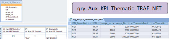
Queries ‘qry_Aux_Thematic_*’
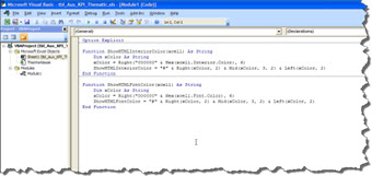
Each indicator has a corresponding query theming - all based on the linked table ‘tbl_Aux_KPI_Thematic’ - our Excel spreadsheet. So we know for each range, which should be the appropriate format. See for example the query ‘qry_Aux_KPI_Thematic_TRAF_NET’, which gets the values for formatting Traffic by NET.
Queries ‘qry_Thematic_*’
With the queries ‘qry_Aux_Thematic_’ available, we can proceed, and use them in queries 'qry_Thematic_’.
Continuing our example, the query ‘qry_Thematic_PERF_NET’, which is based on the table ‘PERF_NET’ and the Auxiliary Query.
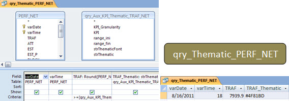
At this point, we already have our queries with the formatting values.
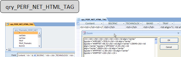
Now let’s learn a way to format the HTML so we can write the data into tables with each cell colorized properly.
Queries ‘qry_*_HMTL_TAG’
To facilitate the way to write the reports in the code, we use queries that concatenate the data in a field called ‘Content’. This field contains the formatted HTML tags as needed.
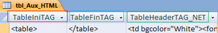
Queries ‘qry_*_UNION’
Ok, the data already has the HTML tags that make up the rows and columns of HTML table. However, we still need to add the header row (also HTML tag) and the lines with the original tags ‘’ and final ‘
These three lines can be found in the auxiliary table ‘tbl_Aux_HTML’.
So now we can create the UNION queries, adding all the necessary data in one place, and already in the desired format.
For this, we UNION queries that join data from field ‘Content’ from the previous data with the help of this table.
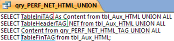
And the result is almost as we seek.
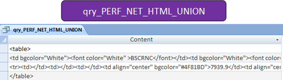
But it’s no good to ‘work’ with UNION queries, for example by calling it from the code. For simplicity, we simply create a new and final query.
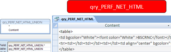
Well, that’s it.
We have just seen the beginning to the end as was done HTML formatting in a single report, grouping network performance (‘NET’).
The statements were made by the Traffic Indicator (‘TRAF’).
However, the generation of other groups reports, and also including other indicators, follows exactly the same procedure here, and all tables and queries are standardized in order to facilitate the extension of more reports and indicators.
The sample data provided are of a fictitious GSM network, and this sample module has already four Reports, which cover almost all the different views of the network.
In addition, it includes all key indicators - KPI’s, serving as a great starting point for detailed investigation of the network. You can use the sample data provided for practice, and understand shown features.
Complete VBA Code
As always, the VBA code is very commented, and most of the functions used must be already known by you, from the other tutorials.
For questions, post questions in the forum - because of the huge amount of Hunter Users, support via emails became practically impossible, we hope you understand.
Table Emails
Finally, our reports can be sent by e-mail, and so we have a lookup table with the recipients’s email. A field ‘SEND’ defines whether the email should be sent to each recipient or not.
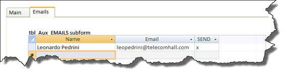
Note: The code fetches the data through the query ‘qry_Aux_Emails’ - which already has a filter in the ‘SEND’ field.
Conclusion
We begin today a series of Hunter Performance Modules, knowing a quick presentation of network data in tables formatted (colors) according to ours settings and sent via email.
The purpose of the Performance Modules is to provide help for the specialized professional analyze data with suggested reports, serving as both an investigative and informative.
The time must be spent on taking action, and never with the processing of data. Automation of Reports brings many advantages, like speed, minimizing errors, efficient control of the issues on the network, among others.
Thank you for visiting, and once again thank those who recognize our efforts, and contribute to the donation to get all the Hunter System.
Download
Download Source Code: Blog_033_Hunter_Performance_-Live_Report-KPI_Summary(via_Email).zip (1.8 MB)