Introduction
In our today’s tutorial, we’ll learn how to work with georeferenced data for KPI’s, an excellent way to display reports and allowing a quick inspection of the network.
Purpose
Plot the data off network togheter with KPI in Mapinfo, creating a thematic map for geographical analyse it.
Our audience is from students to experienced professionals. Therefore we ask for a little understanding and tolerance if some some of the concepts presented today are too basic for you. Moreover, all the tutorials, codes and programs are at a continuous process of editing. This means that if we find any error, for example, grammar or spelling, try to fix it as soon as possible. We would also like to receive your feedback, informing us of errors or passages that were confusing and deserve to be rewritten.
File Structure
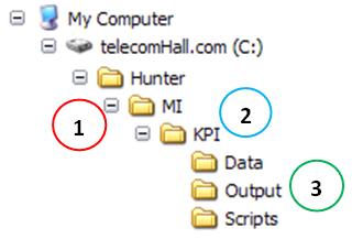
Today we need to create some new directories, exclusive for this module. We already have the directory MI (1) previously created, then create the first directory KPI (2) underneath the directory MI. Then the usual directories Data, Output, and Script (3), which uses’ll detail later.
What will we do?
In fact, the better question would be what can we do. That’s because we show here today the process, and the actions needed to accomplish it. But this is not the only way to do it, that’s for sure.
But then, what will we do? Well, let’s show how we can join the network data with data from KPI, and seeing it geo-referenced, using MapInfo.
So, let’s enumerate what we’ll do today, now knowing that each of these steps can be adjusted according to need and the application we want.
- Export data from the KPI from Access table into XLS format, to a certain time, and at a specific folder (location).
- Look that up in this first action, very simple by the way, we have several possibilities, such as manually exporting through a macro, the VBA code, etc… The period may be fixed in the query, or can be set through an interface. Or we could fetch the data directly through the Mapinfo - would not need to export. And so on. As we are concerned now to know to understand the process, let’s do this manually export.
- Open the exported file in Mapinfo, along with network file sectors.
- The network file sectors - geo-referenced - have been viewed in detail, in a tutorial just for this.
- Combining data from sectors with georeferenced data KPI.
- this point, we have a table georeferenced - with sectors of the network, and a simple table with data of KPI. Let’s see how to associate each KPI table record with its corresponding sector geo-referenced.
- Create thematic maps for the KPIs plotted in corresponding sectors.
- After the data sectors have been georeferenced in thematize then left them in accordance with the values of our data. Let’s see how this is done.
- Finally, we will save some files, with the representation of indicasdores the network at that time.
- far as we have done in various ways. For example, we can save these images with the same default name, and the same be searched for example for an HTML page: update the images, the page refreshes. Or, we can save the images with a predefined naming as imagem_aammdd_hhmm.jpg, then create a form of history.
The possibilities, as we saw above, are many. However, our goal, as always, is to learn how it’s done. Later we’ll do all this automatically . But it is essential to learn the concepts, understand what we’re doing. Otherwise, we will not move anything alone, do we understand the basics.
Another important thing: we always release our creativity. The knowledge, correct understanding of how things works is very important, but also is creativity as well.
When asked about anything in our area, our response is always yes - yes, we can do! And the more knowledge we have, the more ways to solve the problems we have, thus having more chances to do better and faster!
Okay, let’s stop philosophizing and detail as shown in Mapinfo KPIs.
Exporting Access data
Our first action is to export the Access data to a file. In an application, depending on our goal, we exemploter by a query with parameters based on the fields of a form. Or not to have any consultation, and create the same code already in VBA (recordset) and tabmém the code to create the file (output) in the desired format.
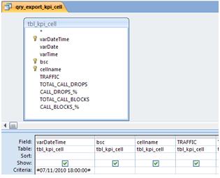
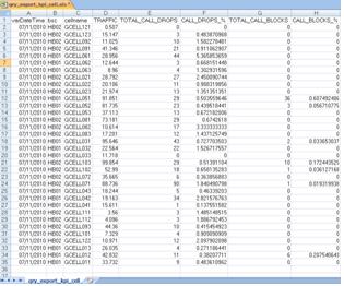
We will show how to export the data manually, using a query with data # 07/11/2010 18:00:00 #. We’ve created just for this example the query qry_export_kpi_cell.
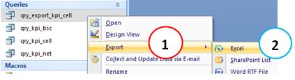
To export the data from that query, click on it with the right mouse button and choose Export (2) -> Excel (3).
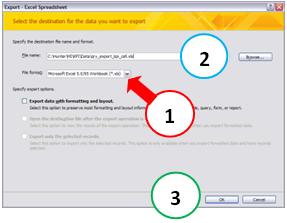
Choose the file format as Excel 5, or XLS (1). Then select the Data directory module MI KPI as local rescue with the filename qry_export_kpi_cell.xls (2). We use this kind of format because it is more common, however, if you are using a version of MapInfo that accepts the new format of Excel 2007 or 2010, there would be problems in using it. Click the OK button (3).
On the next screen, simply click the Close button - no need to save this specification.
Ready, the file was exported, we will continue.
Opening the exported file in Mapinfo, along with the sectors
Now let’s open this exported file in MapInfo. Let us assume that the data sectors are already available and open, as shown below, because we have had a whole tutorial about it. If you have questions, please read again the tutorial Mapinfo Network.
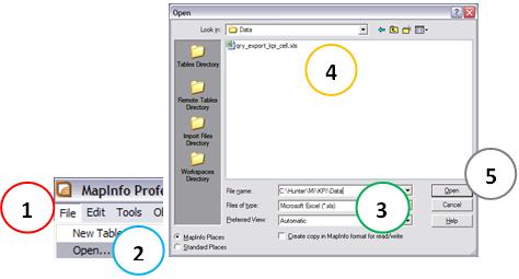
To open the exported file in Mapinfo go to the File Menu (1) -> Open (2). In the dialog box, select files of type XLS (3) and navigate to our archive (4). Then click the Open button (5).
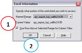
Ok, we have seen how to import a file into the Mapinfo, but this short review does not hurt. Choose Use the line above the title track selected range of Columns (1). Then click the OK button (2).
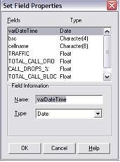
Our data are already in the correct format, but if it were necessary to make some adjustment, is the next dialog box that would do. Here for example, if our field was as TRAFFIC as type Text (wrong) we could correct for type Float. Click the OK button (1).
Note that the table is opened.
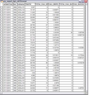
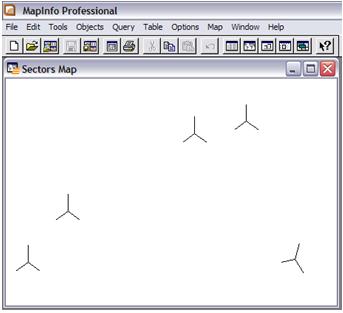
Through the Window Menu New Browser Mapinfo (1), also opens the table Sectors (2).
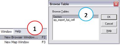
Here we have two open tables, and for the table Sectors have already been created dots and lines for each subject area.
We saw the same tutorial where you learn to plot the data in Mapinfo sectors that can create thematic maps for any of the fields in the table Sectors, because we use the function to create points on it, and thereby create objects in it.
Okay, if you are getting complicated, just remember that for a table georeferenced, as Sectors, each record represents an object, that object may have properties such as shapes and colors. These properties are adjusted according to the values of the fields.
But now it appears that an interesting thing … Note that we have the same fields (only the name is different) in both tables open.
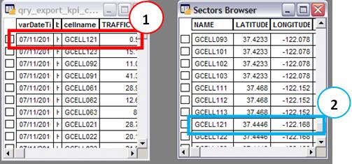
Sectors Table Objects (georeference), the sector has GCELL121 latitude 37.4446 and longitude -122 168 (2). In table qry_export_kpi_cell, the sector has GCELL121 traffic equals 0.5 Erlangs (1).
To our joy, we can use SQL in Mapinfo, as well as Access. The only difference is that the Mapinfo no graphical interface, you can not drag the fields, etc. …
But even so, it loses the power that SQL provides. So let’s continue, and create a query Sectors_KPI.
Associating Sectors georeferenced data with KPI’s
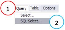
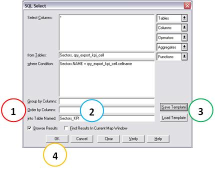
To access the SQL in Mapinfo, go to the View Menu (1) -> SQL Select by … (2).
Sure, we agree that SQL is not so trivial when we have no graphical help.
But follow these steps, and then learn from the result.
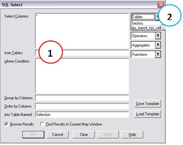
First, we use two tables. So we click in the text box From Tables (1), and the upper right corner (2) choose each one.
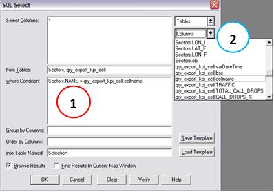
Then we need to inform the field cellname qry_export_kpi_cell table is equal to the NAME field of the table Sectors. For this, we click in the text box’s condition Where (1), then in the listbox columns (2), then insert the operator ‘=’, and finally again chose another field in the Columns list box.
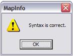
What did we would already be enough, and you can confirm by clicking the Check, which checks the syntax is correct.
Other settings are optional, as the instruction Order By (1). But one of them is interesting tuning, which is the name of the Table Output We replace the default value for Setors_KPI Selection (2). There is also an interesting option, which is to Save the Template and tmabém, load pre-created templates (3). This is especially useful when we have more complex queries, and we use frequently. We are not interested in it now, then click the OK button (4).
See what the end result is the perfect combination of the two tables, since we have a field equal and involved in both.
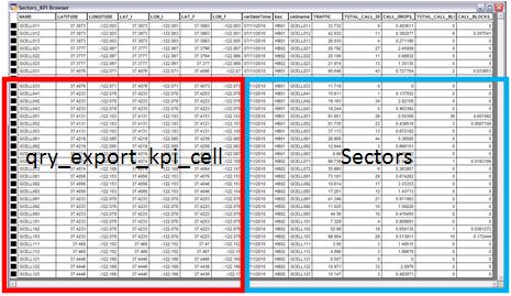
Two observations here. You may notice that our table of KPI is no data from the two sectors. This is not a failure, and it was purposeful, to see what happens. And also, if we had such data for more than one time, our table would also end with duplicate data. Of course we could improve the condition (Where) to only the desired data. We’re just simulating to a schedule for demonstration and learning
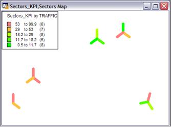
Creating thematic maps KPI
To finally create thematic maps for the KPI’s, or to establish themes each sector according to the value of its corresponding indicator, as an example we will create a thematic map of traffic. < / p>
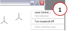
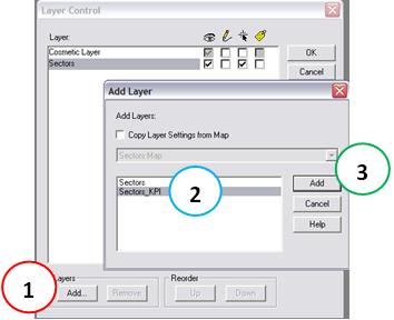
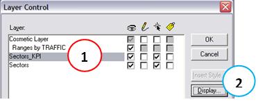
Only one detail. For a map to establish themes, we need to add them the layers we want to work. Although we have created a new table in Mapinfo - Sectors_KPI - this table is not to add them as a layer. Let’s do it. The easiest way to do this is to right click anywhere in the active map, choose the Menu Control Layer (1).
And then click the Add button (1), select the table Sectors_KPI (2) and click the Add button (3).
Yes, now go to the Menu Map (1) -> Create Thematic Map … (2). Let’s create themes based on ranges, ie sectors with zero traffic to a certain value, we define certain properties as the same color green. For sectors such definite value to another, ditto. And so on. Therefore, we chose type Ranges (3). In our final application, we will set everything - colors, ranges, etc… But today, just to avoid complications, we choose the first item in the list. Depending on your Mapinfo, and thematic map which has used recently, its first item in the list may be different. But either way the result, and learning is similar.
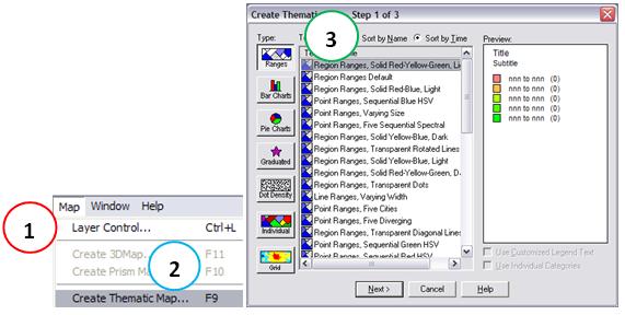
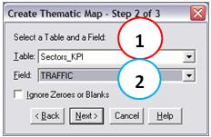
The next step, choose the table Sectors_KPI (1) and field TRAFFIC (2), since we want to establish themes for the display of traffic.
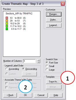
In the final step, there are several possibilities for settings, how to choose specific ranges, styles, etc… Note that here we also have an option to save this template (1) thematic map, more effec use all our settings again if we need to repeat. As we are concerned today only to learn the process, accept the default options of Mapinfo, and click the OK button (2).
See the results.
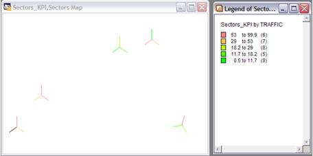
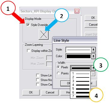
yet was so good, we can give an improvement. Let thicken the lines of the sectors. For this, the control layers (right anywhere on the map), select the base table Sectors_KPI (1) and then click on Display (2).
Then click Overwrite Style (1), then the button with a X (2). In the Line Style, select Pixels (3) as large as possible (4). Click all OK buttons in dialogs.
The result then gets better, right?
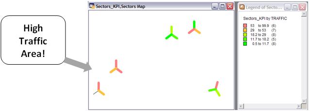
Already we can identify quickly the map above example by which area of our network is more traffic - the lower left.
See also a sector that is no data - and thus was not thematized. NOTE: The black line is the table Sectors. You have the option to remove this table from view in the Control Layer, and so had not evil interpretations. But suggest you leave it indicates that a sector is there, only that it is no data. A minimization of this little problem would be to make the line style of the table Sectors dotted sectors. Anyway, these are all details, you decide how to work.
Well, let’s not extend further. It is important that today you have understood a little of how we can show how geospatial indicators of our network. The same procedure applies for traffic to any other indicator, except for some specific to each one.
Saving data
Just to conclude, we give an example of how we can use the data shown here. A good way is to save images for each indicator in each period, etc… And then we can build reports, is an Excel spreadsheet or even a Web application and / or HTML.
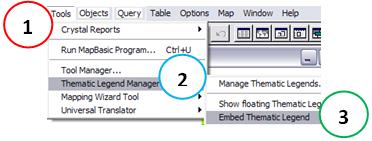
To save an image, it’s good first inserting a legend in the figure before. To do this, go to the Tools Menu (1) -> Theme Manager subtitles (2) -> Insert Caption Theme (3).
Alright … was not very nice using the default values. But the data are correct. As we speak, the styles part, as a legend a little bit lower, most contrasting colors can all be adjusted properly.
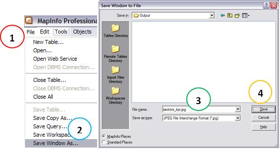
Finally, we will save an image of the current map. Go to the File Menu (1) -> File Save As (2). In the standard dialog box, name, such as sectors_kpi (3), and click the Save button (4). Choose the type of image you want, such as JPG or PNG.
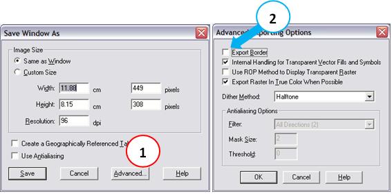
Before saving the image, even Mapinfo gives you the option of making some final adjustments. The same tip is to click the Advanced button (1) and the new dialog box, uncheck the Export Edge (2).
Well, that’s it for today. If you could understand how the process works, great. Will soon be doing everything in an almost entirely automated, but this knowledge is an important, and worth having.
Conclusion
In this tutorial we learned how to plot the data KPI Mapinfo in our network, creating a thematic map for geographical analysis of them.
We hope you’ve enjoyed. If you have any doubts, find the answers posting your comments in the blog or via our support via chat or email.
Till our next meeting, and remember: Your success is our success!
Download
Download Source Code: Blog_019_Hunter_KPI_(MI_KPI).zip (72.9 KB)